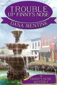
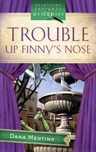
A word or two more about covers. Nowadays, writers and art departments have to think about a digital world. Imagine that spiffy cover with the delicate lettering and the finely drawn details shrunk down to the size of a postage stamp. All of us internet surfers are whizzing on by and we definitely are not going to linger over a dull image with writing so fancy we can’t make it out, or, worse yet, a “photo not available” icon! That cover image has to be formatted so it will appear correctly in various digital venues (Smashwords, Kindle, Nook, etc.) This is when I get out the checkbook and pay someone who is tech savvy. I insist on bright colors and my name, title in plain lettering. It’s enough to cause people to linger for a moment, click on the image and see it in all its glorious detail.
Below are the print version of my first book and its digital counterpart. Which one do you prefer and why?


Posted by Shanda on June 17, 2014 at 6:56 pm
I prefer the first one. The second seems comedic, but it has a crowded feeling, a seeming cramming of stuff, then your name is slanted, like a slapped-on sticker. But it looks fun, so nothing wrong with it. I will say, however, that the title is awesome. That’s what made me get it on Amazon, well first pique of interest drawing me to read the blurb. The first cover is the one showing on Kindle for me. And I had no idea it was a Heartsong book. Love the crazy characters.
LikeLike
Posted by dana mentink on June 17, 2014 at 7:05 pm
Thanks very much, Shanda.
Dana Mentink award winning fiction author http://www.danamentink.com
>
LikeLike
Posted by Sandy Fox on June 17, 2014 at 6:46 am
The second one! Bold, bright pictures to capture the scene rather than fog, focuses the reader, who questions, ” Why are there legs sticking up?” Captures the mystery! If your looking for first impressions, I vote second 🙂
LikeLike
Posted by dana mentink on June 17, 2014 at 1:13 pm
Thanks, Sandy! Love your ideas!
Dana Mentink award winning fiction author http://www.danamentink.com
>
LikeLike
Posted by Angie Carroll on June 17, 2014 at 2:17 am
I like the top one because I can see the whole fountain!
LikeLike
Posted by dana mentink on June 17, 2014 at 1:17 pm
Thanks, Angie!
Dana Mentink award winning fiction author http://www.danamentink.com
>
LikeLike
Posted by susanmsj on June 16, 2014 at 10:25 pm
I like the top one. In the bottom one, the first thing that jumps out are the curtains.
LikeLike
Posted by susanmsj on June 16, 2014 at 10:51 pm
I have read these books, by the way. They were very good.
LikeLike
Posted by dana mentink on June 16, 2014 at 11:21 pm
Awwww. Thanks, Susan!
Dana Mentink award winning fiction author http://www.danamentink.com
>
LikeLike
Posted by dana mentink on June 16, 2014 at 11:21 pm
🙂
Dana Mentink award winning fiction author http://www.danamentink.com
>
LikeLike
Posted by Patrice Whynott on June 16, 2014 at 9:54 pm
I’M NOT SURE WHICH IS THE DIGITAL COPY BUT I LIKE THE TOP ONE BECAUSE THE FOUNTAIN WITH THE WATER FLOWING OVER IT IS BEAUTIFUL ! IT MAKES ME FEEL SO CALM …
LikeLike
Posted by dana mentink on June 16, 2014 at 11:22 pm
Glad you liked it, Patrice!
Dana Mentink award winning fiction author http://www.danamentink.com
>
LikeLike
Posted by Rick Estep on June 16, 2014 at 8:44 pm
My preference is for the top cover as it gives a clear, more uncluttered visual.
LikeLike
Posted by dana mentink on June 16, 2014 at 9:40 pm
Uncluttered is good! Thanks for the comment, Rick!
Dana Mentink award winning fiction author http://www.danamentink.com
>
LikeLike
Posted by Valri Western on June 16, 2014 at 3:15 pm
I prefer the top one! I like the whole fountain!
LikeLike
Posted by dana mentink on June 16, 2014 at 3:50 pm
Thanks, Valri!
Dana Mentink award winning fiction author http://www.danamentink.com
>
LikeLike
Posted by Suzan Michet on June 16, 2014 at 2:02 pm
I prefer the top one (not sure if it is the print or digital one !), the curtains in the bottom one seem to close it in too much.
LikeLike
Posted by dana mentink on June 16, 2014 at 2:25 pm
That’s the original print cover. I did like those curtains, too!
Dana Mentink award winning fiction author http://www.danamentink.com
>
LikeLike
Posted by Rhonda Caldwell on June 16, 2014 at 9:02 pm
I like the top cover. The fountain, full with flowing water, really catches my eye. I also like the graphic used with the book title and author’s name! The bottom cover curtain is too pronounced. It seems to cut off the view of the fountain/town square.
LikeLike
Posted by dana mentink on June 16, 2014 at 9:39 pm
You have an eye for detail, Rhonda! Thanks for the comment!
Dana Mentink award winning fiction author http://www.danamentink.com
>
LikeLike